HOW TO STYLE YOUR COFFEE TABLE
USING PIECES FROM OUR GIVEAWAY
I am convinced that Lilah Lifestyle Co. has the best home decor. I was lucky enough to partner with them for a give away with the launch of the new blog design. After seeing how amazing the quality of their products were in person, I was hooked! To show you just how amazing they are, I decided to style my coffee table around all of the pieces that were in the give away. Here is a step - by - step guide to recreate the look.
Watch the Video
start with
Layering Tonal Books
These books have been a staple in my home forever. Unfortunately, the dust covers have gotten really banged up over time. I finally decided to take the dust covers off. They are even more beautiful without the cover! They are all different shades and patterns of white - just perfect for styling. I knew that I wanted the perimeter of the coffee table to be more weighted. So, I played with how to rotate and stack the books to get the right amount of height and weight on each side of the table.
CREATE YOUR OWN
add pieces with
Medium Weight
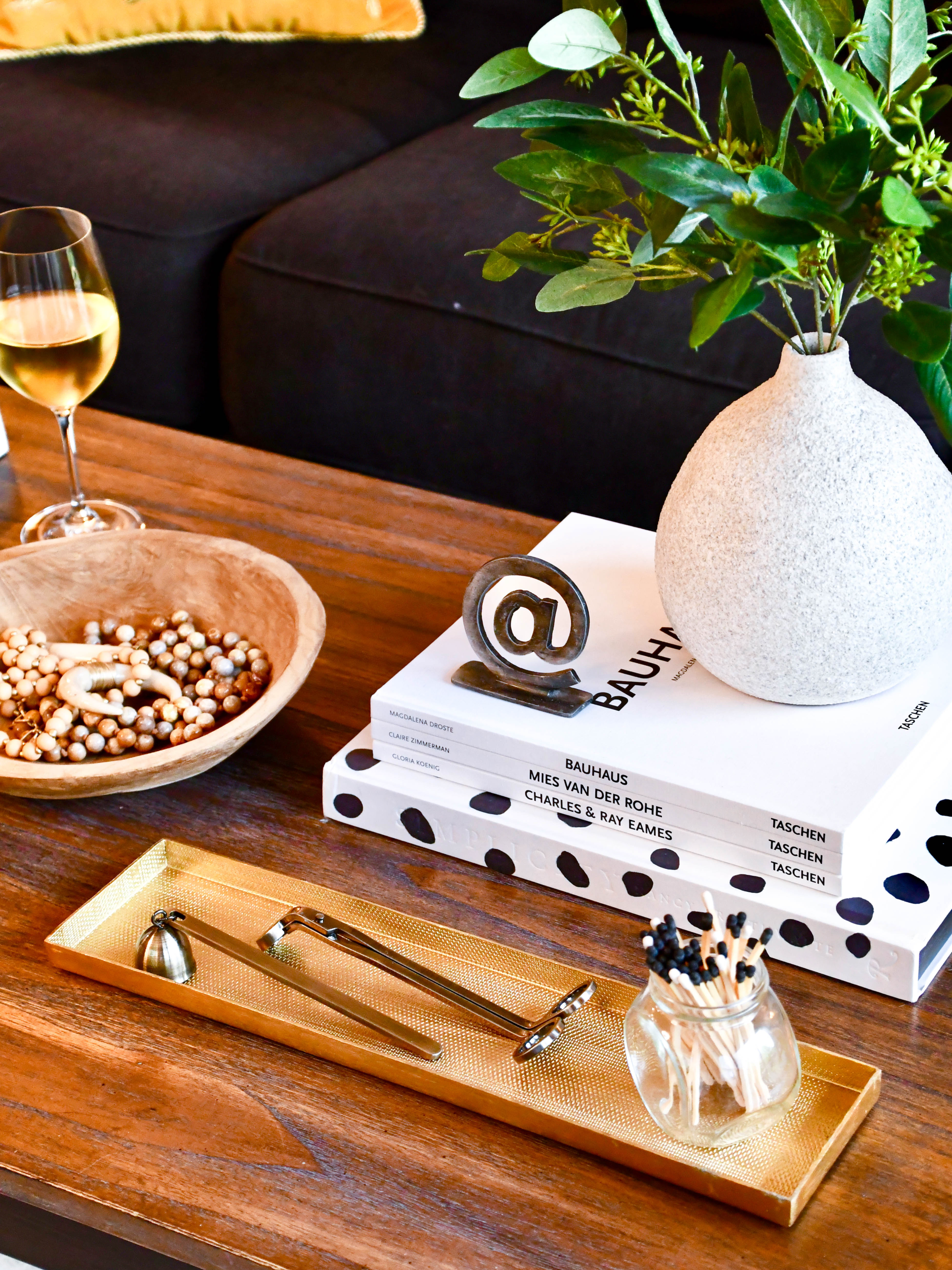
These pieces are both from Lilah Lilah. We used their brass metal tray and timber wood bowl. I loved putting these two pieces together because they were contrasting in both the shape as well as the finish. Both the contrasting shape and mixing the more polished and rustic finished materials created a nice juxtaposition on the table.
Create your own
Next up, add
Pieces with Height
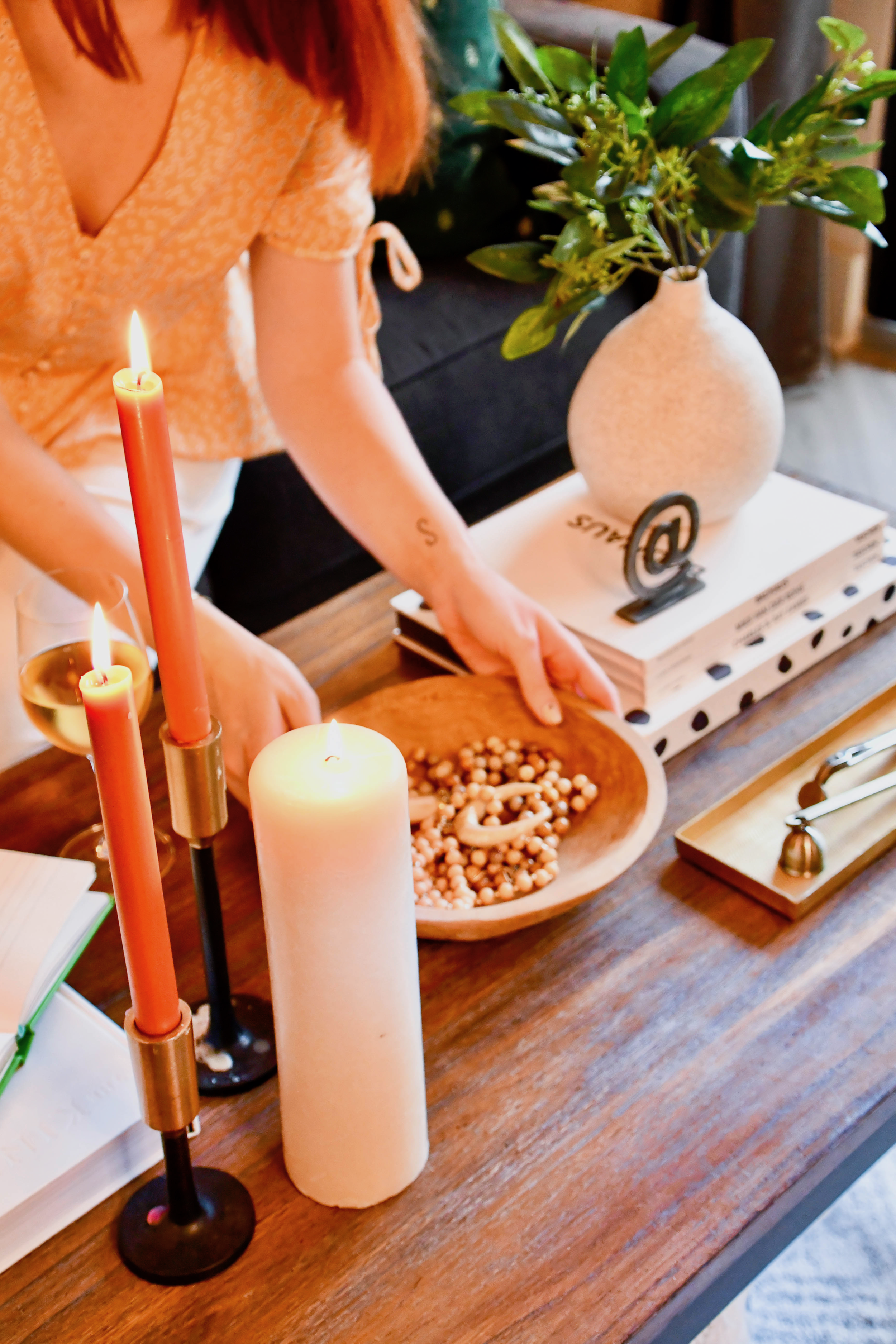
I like to add multiple layers of height in different places in the vignette. This way your eyes kind of dance around. One grouping of height is made with a variety of candles. These candle sticks are great for adding variety in height. Since these were really slim and tall, I wanted to add a third candle that was a little wider and had more visual weight. The next group of height is adding to our larger stack of books with Lilah Lilah’s Heilix vase. I really love the texture this vase has. It is such a nice contrast against the smooth white books.
Create your own
ADD PIECES OF
Interaction
This is my favorite step. I think a vignette should always have a playful element to it. Here, I put a sketch book and left it open. This is a fun way to encourage doodling, or write down random thoughts. Below are some other cute things you could use. My favorite thing is the chic tic-tac-toe box display. You could also use a set of game cards, dominos, or a chess board. You can’t go wrong!
create your own
ADD PIECES TO
Honor the Elements
Ok, hear me out here. I’ve recently started playing with this concept in my house. In the four corners of my living room, I have a piece of decor that represents each element. At first, I thought this concept was crazy. But, the more I live in the space I feel the vibe or energy of the space to be more calming (who know’s if this is all just in my head - but we need all the calm vibes we can get!)
So, here’s the gist: Each element in a vignette or room should have a component to honor the elements - earth, water, wind, and fire. You can choose to take it at face value as a guide to help you style. Or, you can play around with adding sage, and other ceremonial elements that help the chi of the space.
Here we added the faux florals in vase (earth + water), matches (fire), and ceramic beads in the wooden bowl (earth).
Create your Own
lastly, add
Functional Items + Small Decor
This is the last step, because it is the most important! These functional items are set last because they are the most used, and the most commonly taken out of the vignette. I like to style them last so I assure the rest of the vignette can stand it’s own when these elements are removed. Here, we placed the candle wick cutter and stuffer with the matches on the gold tray. We also placed the mixed stone coasters within easy reach.


