SMALL ENTRYWAY IDEAS
perfect for renters
What is the saying about first impressions…? I think the first thing people see when they walk in your home sets the tone for the rest of your home, no matter the size! Plus, a great entryway can serve as a catch - all for your keys and anything else you need before running out the door! Today we’re diving into what 4 components make a successful entryway, even in a small apartment, and how to create one of your own!
Work with the Space you have
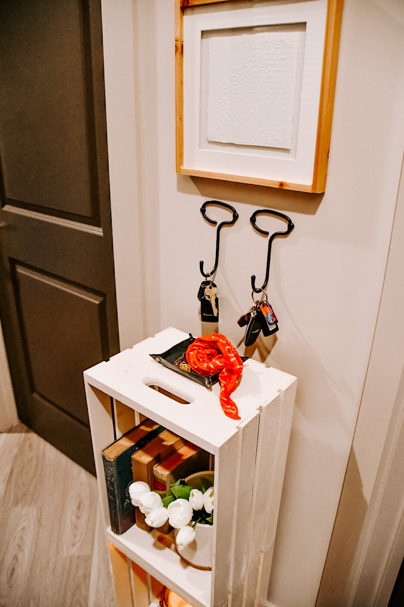
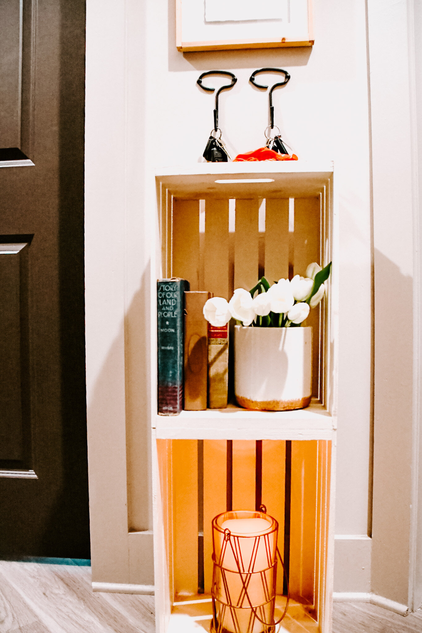
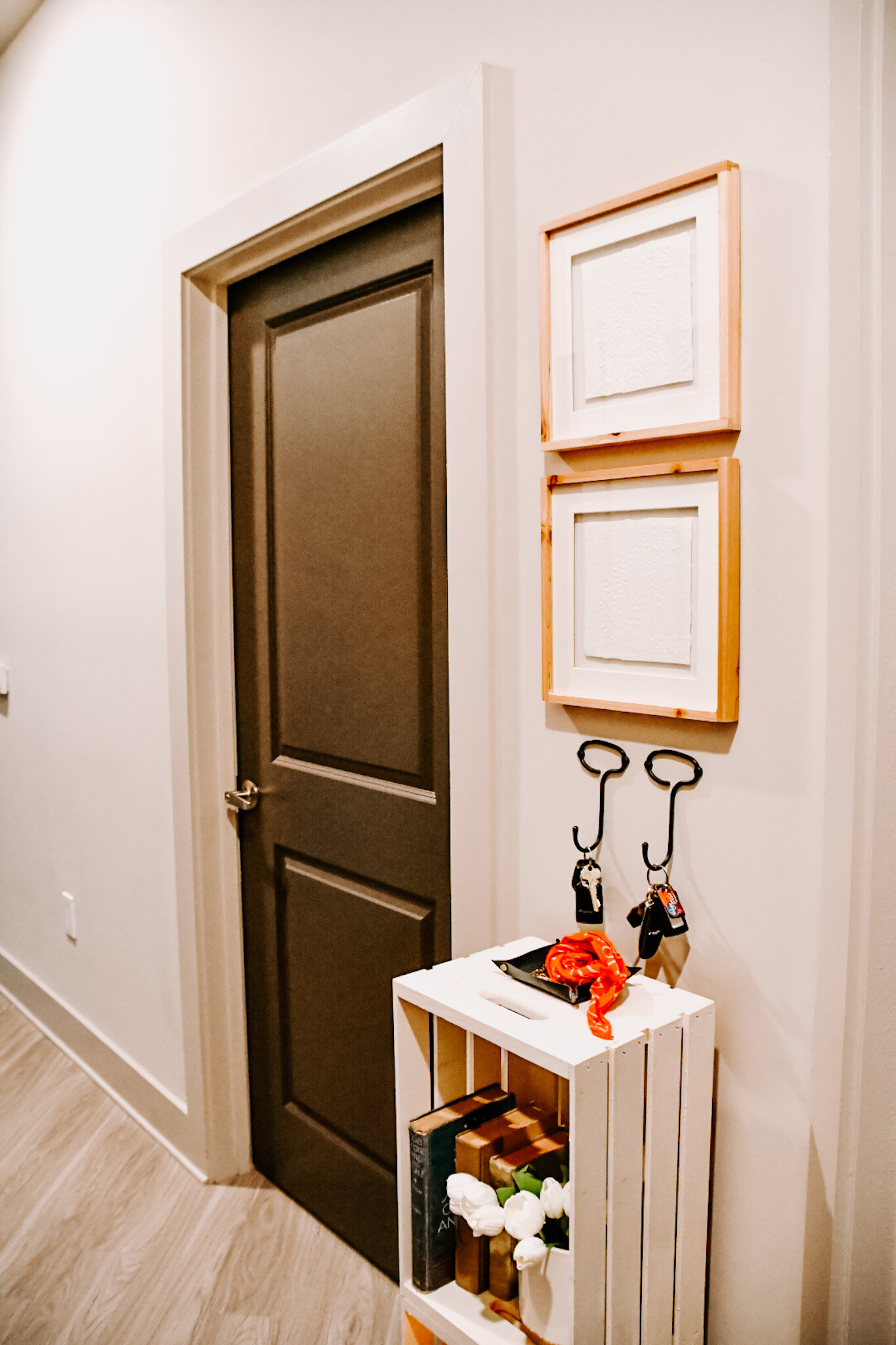
In apartments we all know that space is LIMITED. For example, in our house you enter on a corridor. This is great for privacy, but there isn’t much room for a large entry way console. So, I worked with the space we had and created a small console table out of milk cartons. I did this DIY project back in high school, so it could definitely use some improvements. However, this makeshift console was a perfect fit for this little space we had! Here are some other smaller console or pedestal tables that could work for your space.
Design with functionality in mind
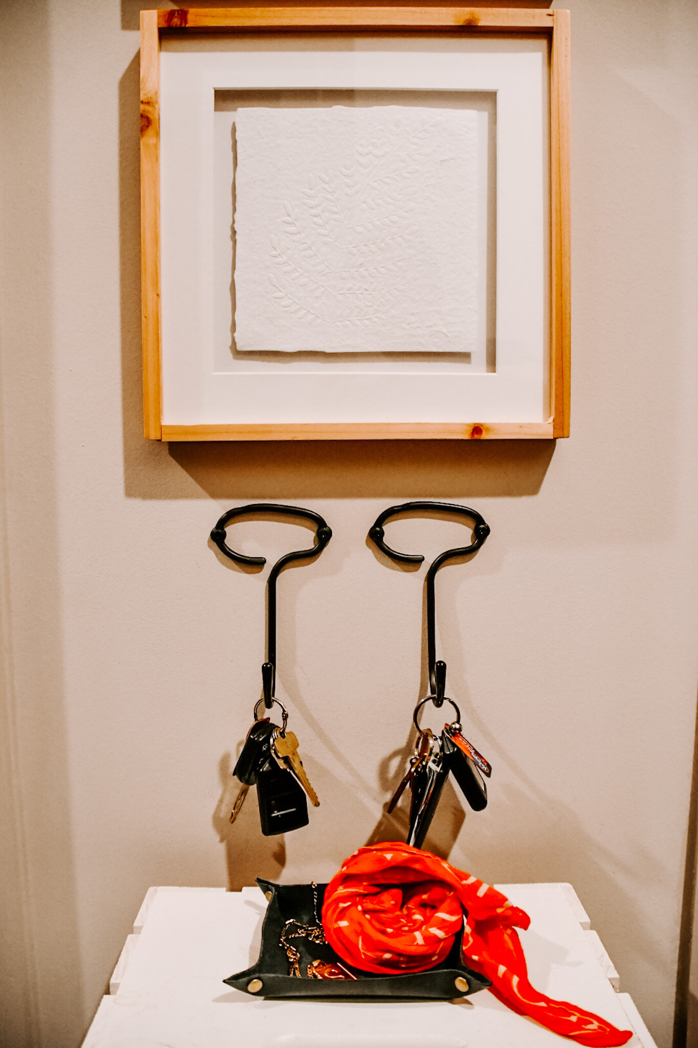
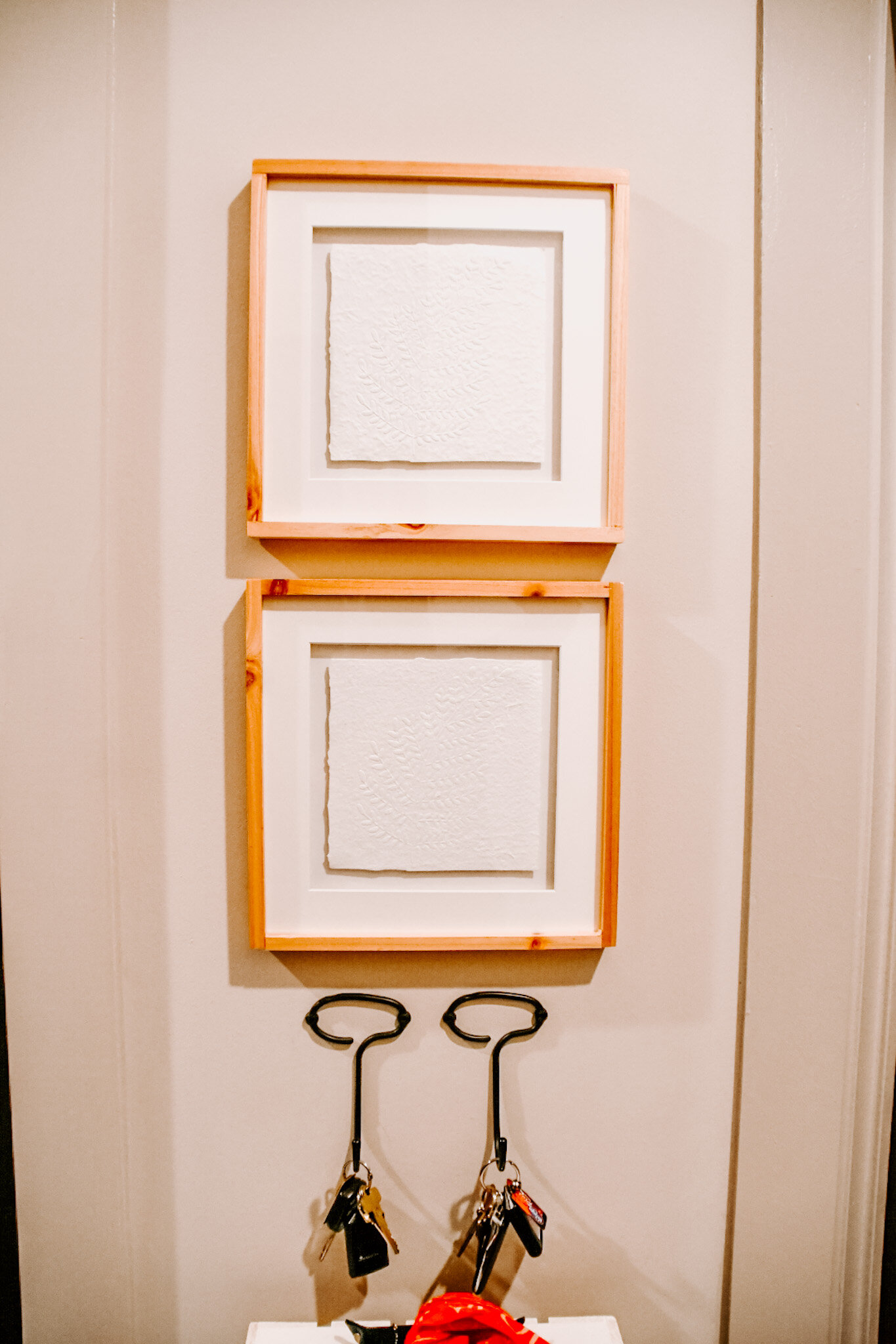
Since our entry console is very small, I knew I didn’t have much space for a tray or a bowl to catch our keys and other small items. So, to keep the little surface area we have clutter free I installed these key hooks right above the table. It works out perfectly for both of us because the key hooks are literally 3 steps away from the front door! Also, if you have someone in your household that loses things a lot (aka Matt) this is a perfect solution to help them keep everything in one place.
Shop the best decorative key hooks
Style with Meaningful items
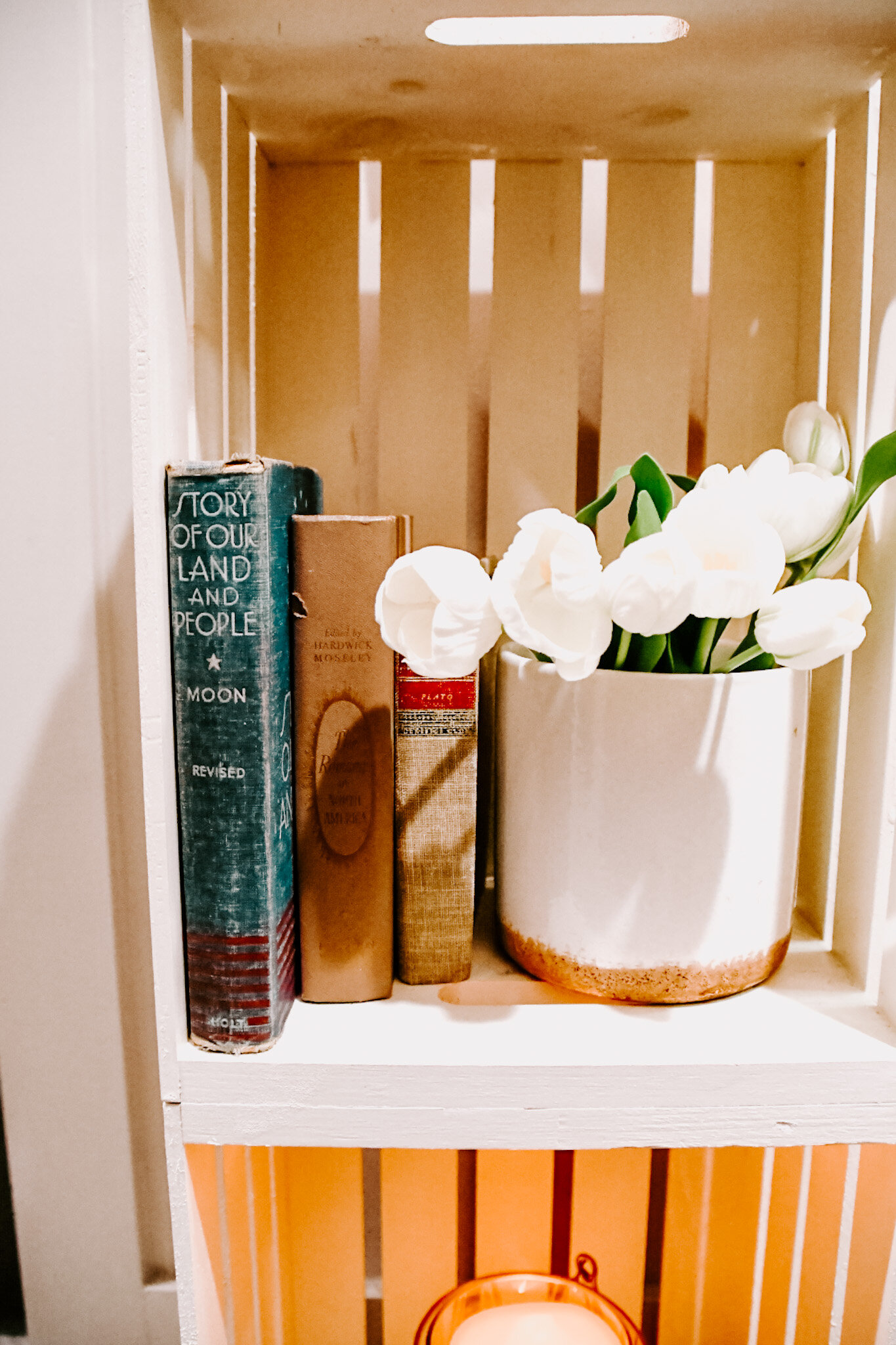
Remember what I said about first impressions? This holds true to styling as well. In our entry way console I have some of my favorite poetry books on display. My grandmother loved poetry and every time I walk in these books remind me of her. I am probably the only one that knows this about this entry console. However, I think the more you can tell a story with the items around your home the more fulfilled you will feel when you are around them!
Proportional Artwork
Scale and proportion are really your friend when styling a smaller vignette. If one pice of the vignette is out of proportion the whole vignette will look “off”. My rule of thumb is whatever artwork is above your console shouldn’t be wider than the width of the console. It can be challenging to find artwork that is so small when your console is so narrow, but that’s why you come to Snow Studio, right?! Here are some of my favorite small scale artwork pieces that you can hang in a pair above your console.
That’s it! By following these 4 easy steps you can create the best small entryway vignette and set the best first impression for your home, no matter the size!


