3 EASY WAYS TO STYLE AROUND YOUR BED
In my latest instagram poll you guys answered with a tie between your bedroom and living room for the “if you could redesign any room in your home” questions. So, you can file this under that bedroom redesign folder. Today’s post is all about ways to style around your bed. We’re covering three different ways you can successfully style around your bed, plus ways you can recreate each look yourself!
I think the biggest key when designing the wall behind your bed is proportion and balance.
LET’S TACKLE BALANCE FIRST
In all three of these examples they are all designed in some form of three (remember me raving about designing in groups of three…check it out here.) My room really lends itself to this because I have two of the same night stands on either side of our bed. If you approach this by having the same grouping over each night stand, and then a different grouping over your bed, you can’t go wrong! You don’t HAVE to design in a balanced manner like this, but if you have two night stands on either side of your bed like me this trick lends itself to easy and successful styling, no matter the pieces you choose to hang up
NOW, let’s talk about proportions.
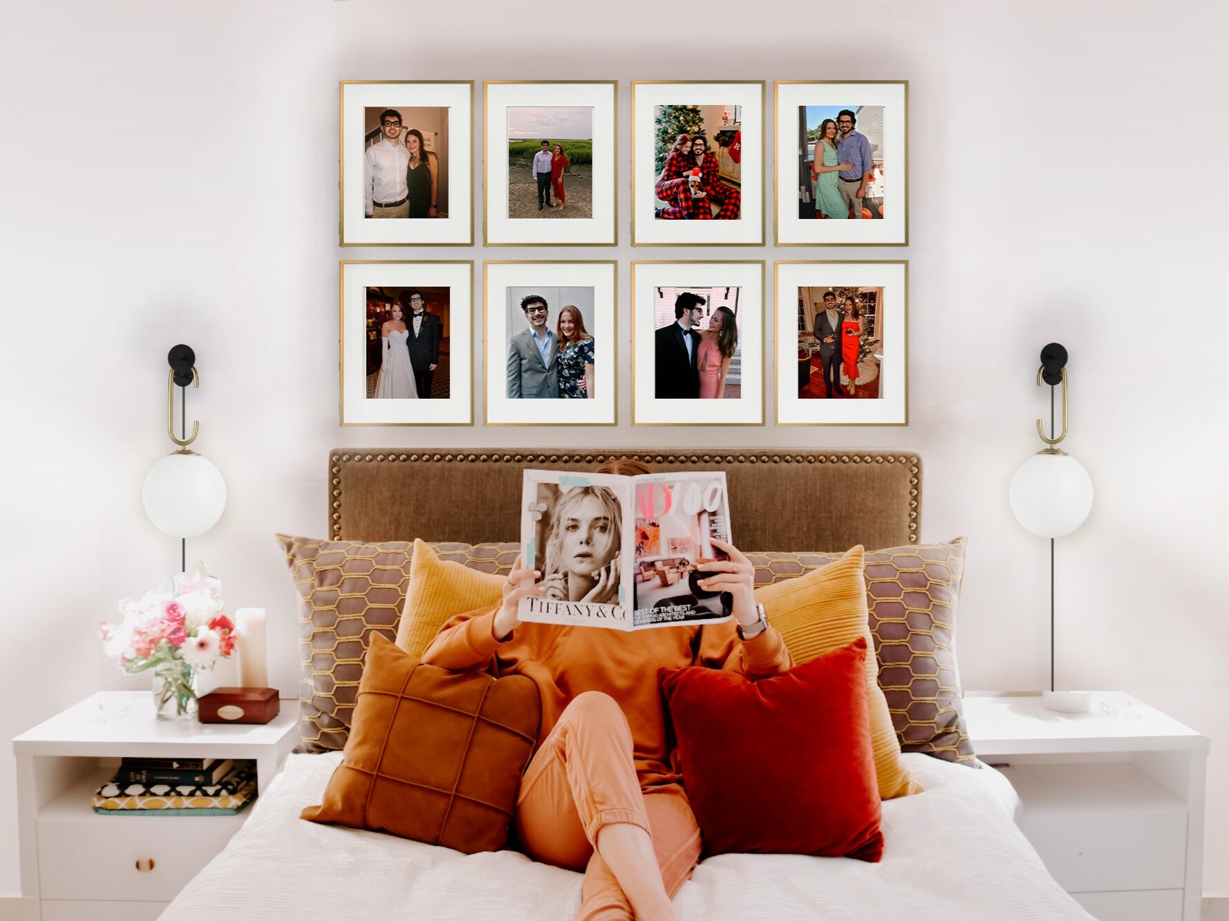
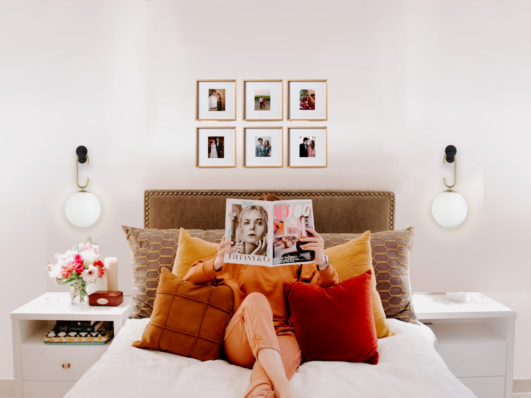
Most people say that handling proportions is all about having an *eye*. Some of that is right, but it’s also about practice, and readjusting!! I photoshopped the last two options here, so I will use a photoshop photo as an example. In option two below you have two wall sconces over each table and a grouping of photos over the bed. Seems simple right? Yes, but it is only successful because of the proportions used here. Check it out if I were to swap out these 16” x 20” Portrait frames with square 10” x 10” smaller frames.
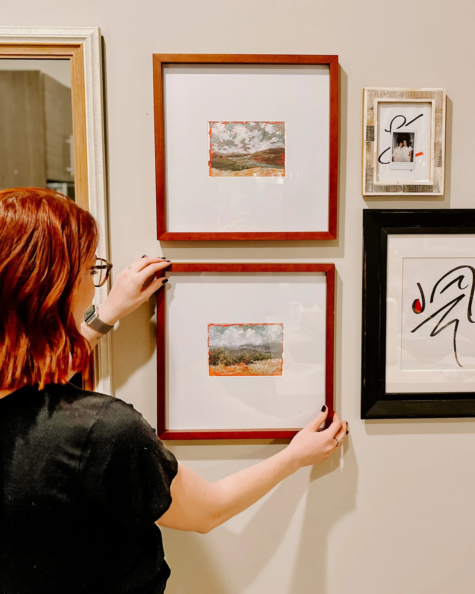
Not as successful right? You can practice this yourself at home either with using photoshop, sketching it out, or with putting masking blue tape up on your wall to map out the sizes and quantity you think will work best. Check out how I did that with the wall opposite this headboard wall. Having a plan and configuring the proportions BEFORE you buy anything will give you a much more successful end product.
Let’s Get Into the Design Options
OPTION ONE
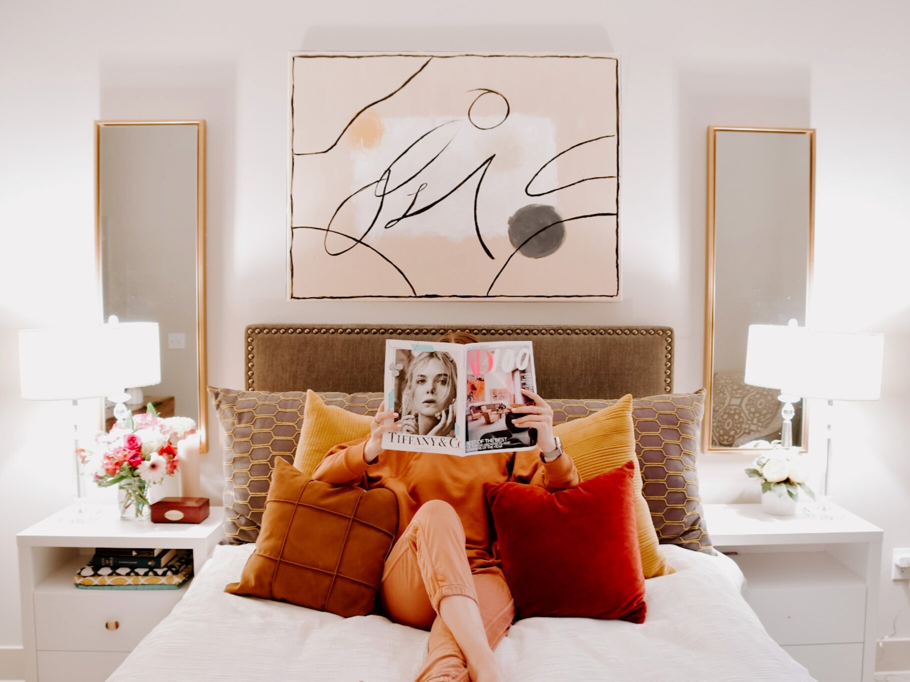
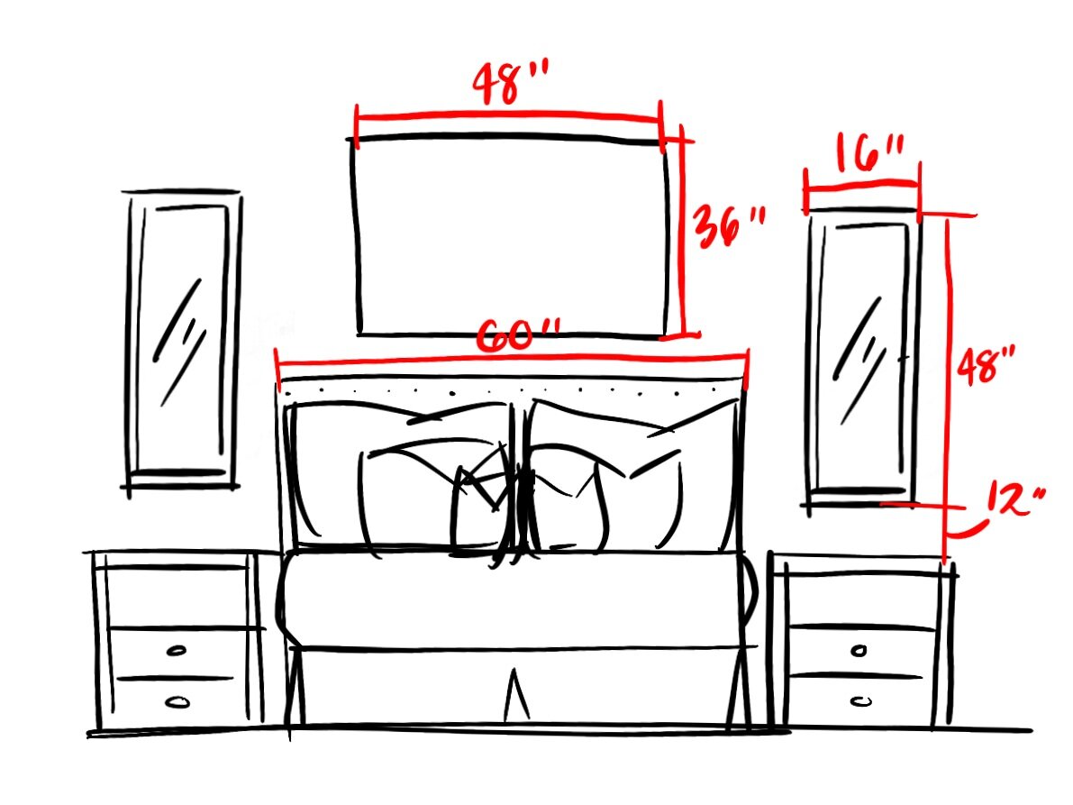
This is obviously the one we went with. I asked you guys a while ago about your suggestions for which would work best in our space, and you guys really liked this configuration! I have to agree! The tall mirrors really guide your eye upwards. I love this because our ceilings are 12’ tall. I feel like the height of these mirrors are the perfect volume for the space. I really love how the custom painting (by your’s truly) turned out. I wanted something to complement the throw pillows on our bed. Here’s a break down of the sizing for each piece so you can recreate it yourself:
OPTION TWO
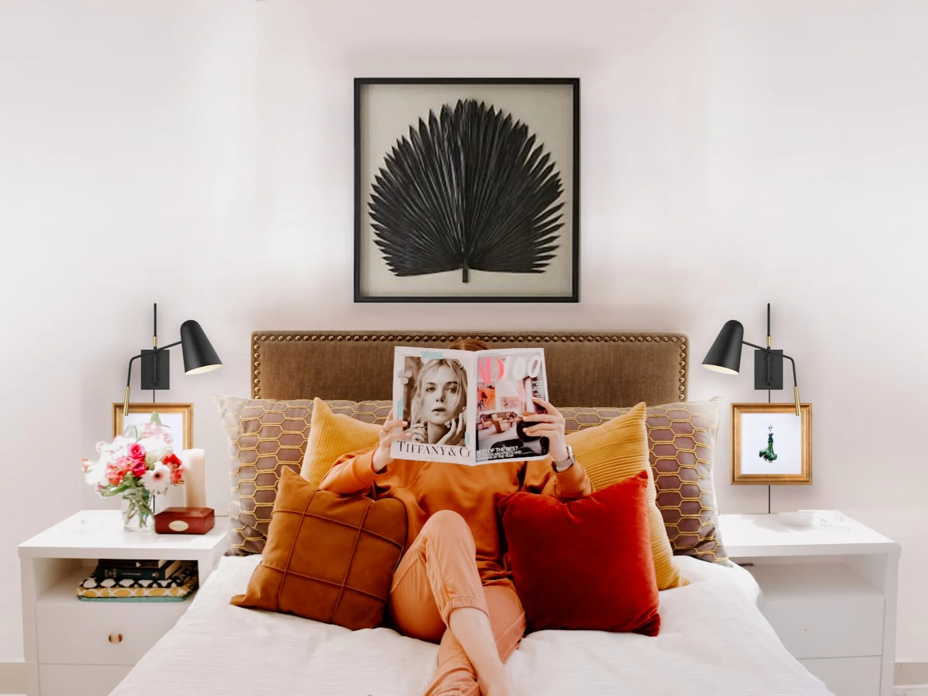
For this option I wanted to explore a gallery wall style above the bed. I kept above the night stands more simple with plug in wall sconces from CB2. This way all the focus was right above the bed, and on the height of the ceiling.You can play around with the size of the frames you want here, just make sure you focus on the proportion and balance like we talked about earlier!
OPTION THREE
This option is probably my second favorite from what we went with. I really love the small framed piece covering up the cord for the plug in wall sconce, and the bold art statement above. This piece is 39” square framed, so it was the perfect scale for my 60” wide queen bed. If you have a king bed, I would suggest going with either one landscape piece that is at least 48” wide, or two square pieces that are a total of 40-50” wide. The trick here is that you want the pieces above your bed to cover at least two thirds of the space above your bed.
So how big should the artwork above my bed be?
Queen bed (60” wide) - your artwork above your bed should be between 38 - 60 plus inches wide.
King Bed (76” wide) - your artwork above your bed should be between 48” - 80 plus inches wide.


